
Access by Storable
Building a unified access control platform from the ground up.
PROJECT SNAPSHOT
Role
Lead Designer
Platform
Web + Native Apps
Team
Coordinated with rotating PMs, engineering partners, and insurance product teams. With research plan approval and design critique support.
Problem
Members struggled to find saved insurance quotes digitally, often calling support multiple times to retrieve and purchase them.
Solution
Designed a centralized self-service quote hub consolidating nine fragmented saved quote experiences.
Impact
~100K support interactions shifted to self-service annually
~5.6M minutes of support time eliminated
~$10M+ operational cost reduction per year
Overview
Storable’s access control ecosystem was fragmented across multiple third-party integrations, each with inconsistent capabilities and high maintenance overhead.
I led design for a net-new, 0→1 product that unified these systems into a single, scalable platform—laying the foundation for future embedded services across Storable’s product suite.
Problem
Storable relied on multiple access control integrations across its facility management products.
This created:
Inconsistent experiences across products
Limited functionality depending on integration
Operational complexity for both customers and internal teams
Dependence on on-premise systems in some cases
Most critically, access failures disrupted facility operations. For operators, gate access is their “lifeblood.”
Opportunity
Design and launch a single, unified access control solution that could:
Replace fragmented integrations
Scale across all Storable products
Reduce long-term maintenance costs
Serve as a foundation for future platform services
We aligned on a system that combined:
A shared backend
An embeddable micro front end
A design system foundation for future reuse
Approach
0 → 1 Product Strategy
This was a true greenfield effort—no existing system, patterns, or shared UI foundation.
To de-risk and accelerate delivery, we:
Focused on SiteLink (largest customer base) for initial rollout
Defined a tight MVP scope based on highest-value use cases
Validated early and often with real operators
MVP Definition
Through internal analysis and competitive benchmarking, we identified core capabilities:
Instant access provisioning at move-in
Automatic lockout for delinquent or moved-out tenants
Access activity logs
Remote gate control
Group-based access tied to unit or tenant attributes
Research & Validation
I used rapid prototyping and customer feedback loops to shape the experience. Here’s what I learned:
Automation is critical
Unit-to-zone auto assignment saved time and reduced human error
Manual overrides raised security concerns
Reliability outweighs features
Hardware stability mattered more than feature depth
Access control is mission-critical to daily operations
Remote controls are secondary
Useful, but not frequent enough to prioritize in primary workflows
Design System & Platform Thinking
Because this was a 0→1 product, we also had to define how it would scale.
Key contributions
Designed Storable’s first reusable component library
Leveraged Bootstrap to accelerate development and reduce custom code
Established typography, color, and layout systems aligned to brand
Built a responsive framework adaptable across products
Impact
Enabled faster development across teams
Created consistency across the product ecosystem
Established a foundation for future embedded services
Solution
Minimum Lovable Product (MLP)
We delivered a centralized experience that allows operators to:
Monitor real-time access activity
Manage access points without losing context
Automatically assign units to access zones
Adjust tenant permissions and defaults
Filter and locate data quickly
Remotely control gates when needed
The experience emphasized clarity, speed, and reliability—aligned to core user needs.
Impact
First 6 months:
201 facilities onboarded
$18K in monthly recurring revenue
Business impact:
Reduced reliance on multiple third-party integrations
Lowered support burden tied to access issues
Created a scalable platform for future products
Reflection
This work represented a shift from feature-based integrations → platform thinking.
By leading design on a 0→1 product, I:
Helped define a new product category within Storable
Introduced system-level thinking across teams
Established a foundation that extended beyond a single use case
Designing a Scalable Framework
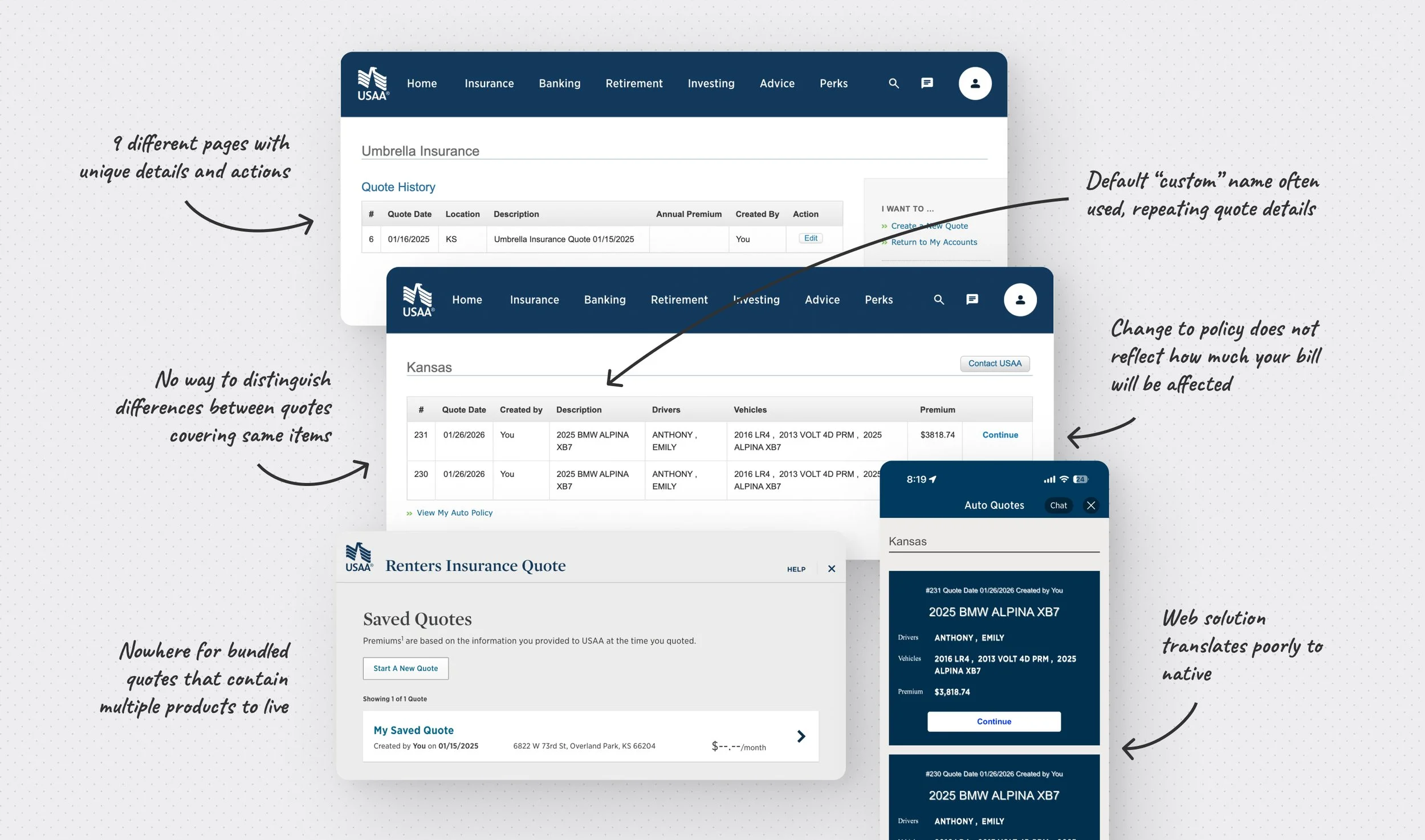
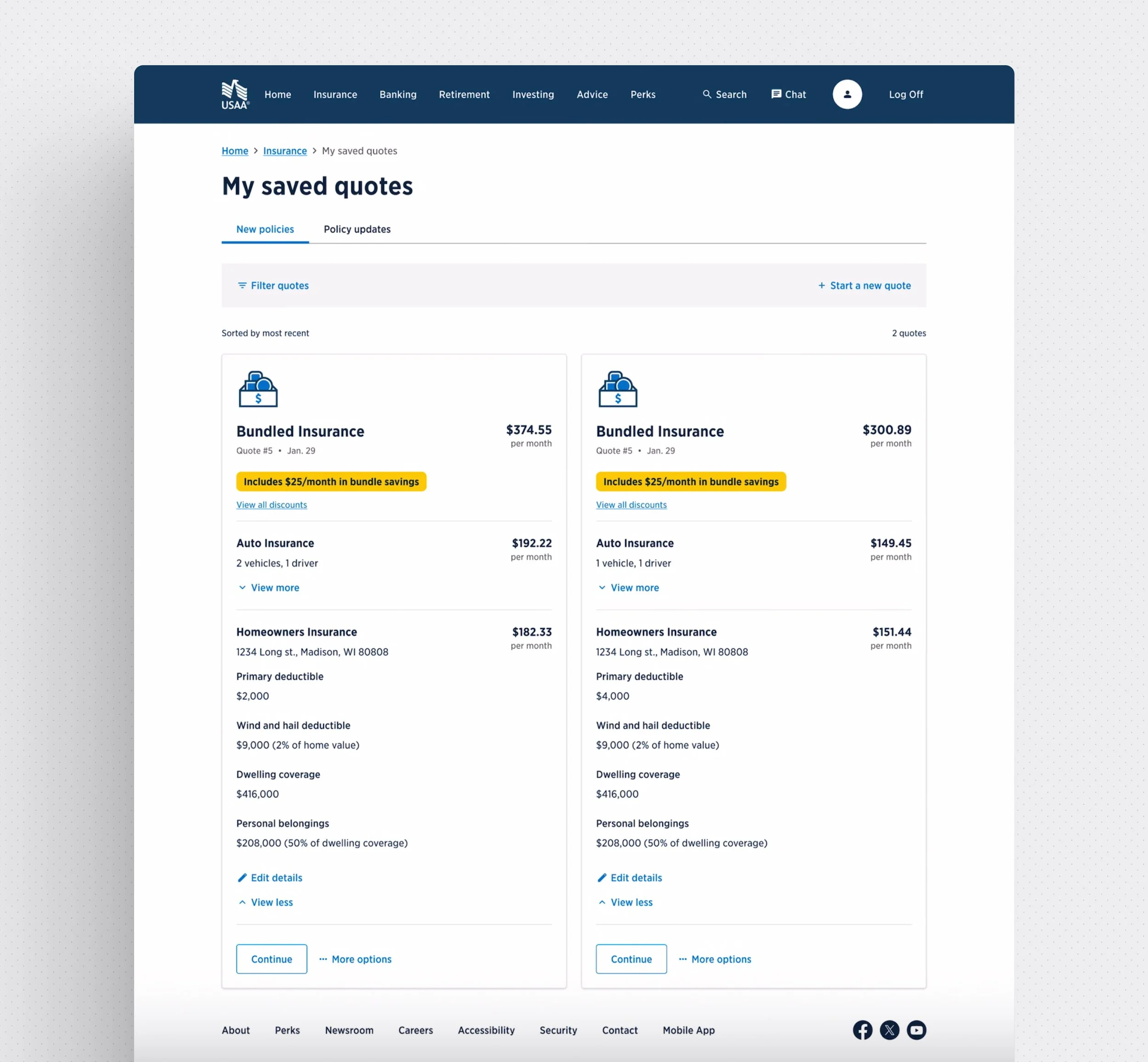
The original scope was limited to the USAA website, with a native app experience to come later. I worked with 5 different product teams and dove deep into the actual quote building experience for each product to understand what was unique and where they overlapped. I also spent time with experts in our backend policy-building and saving system to understand the various stages of completion a quote might be saved in.
We needed this framework to display quotes for entirely new policies (acquisition), as well as current policy holders that were quoting changes (servicing). Even if the products were the same, these transactions had entirely different rules we needed to support. Despite their backend differences, we aimed for consistency on the front end for our users.
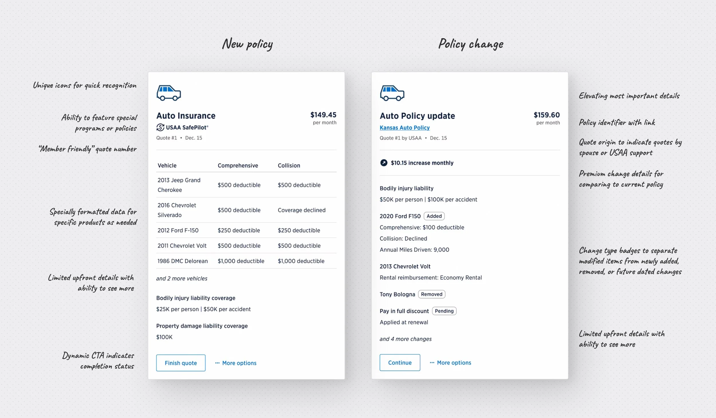
I started with the least amount of details possible for each product, only growing the detail set to ensure compatibility for scenarios where users would need more info like special policies or unique timing. Throughout the project, product teams often pushed to display as much information as possible. I advocated for a streamlined approach that avoided cognitive overload, reinforcing the decision with usability testing results that demonstrated stronger comprehension and task completion with a simpler interface.
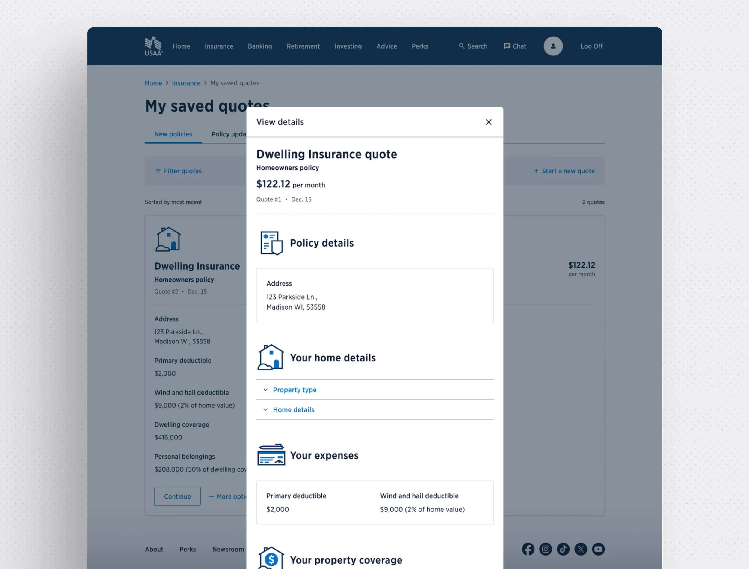
Based on member feedback we knew comparison features were desirable, but we did not have capacity to build a full fledged tool for that any time soon. To bring the most value out of our MVP I pushed for displaying relevant details up front to enable side-by-side compare-ability. Insurance products contain a large number of configurable options, so we used survey data and policy data to determine which information was most important for users when reviewing saved quotes. We also used policy data to define limits and prevent information overload, i.e. 95% of auto policies have less than 5 vehicles so we prioritized showing no more than that many vehicles in the default view. By leading with quote details we also eliminated the need for custom quote names, a feature that was rarely if ever used. If members wanted more details, we added the option to open an expanded details view without entering the quote flow, enabling deeper dives while staying in context of the hub.
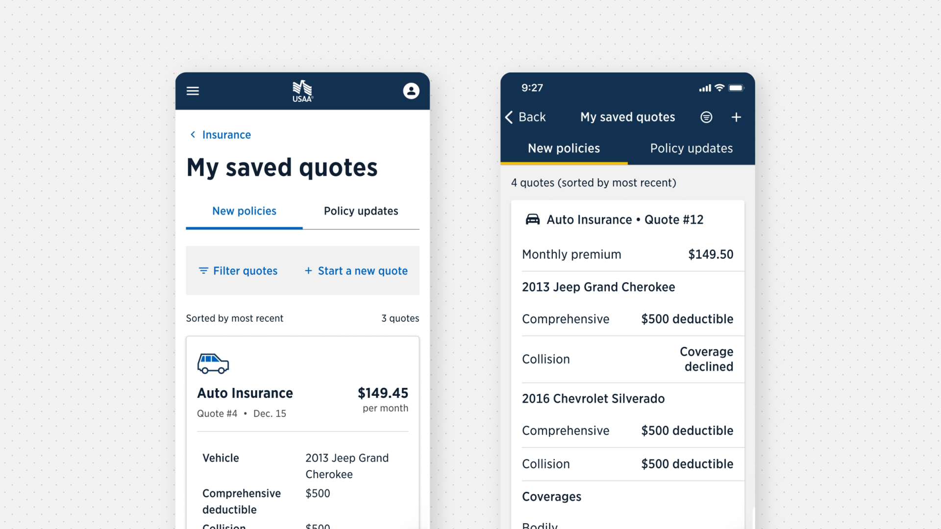
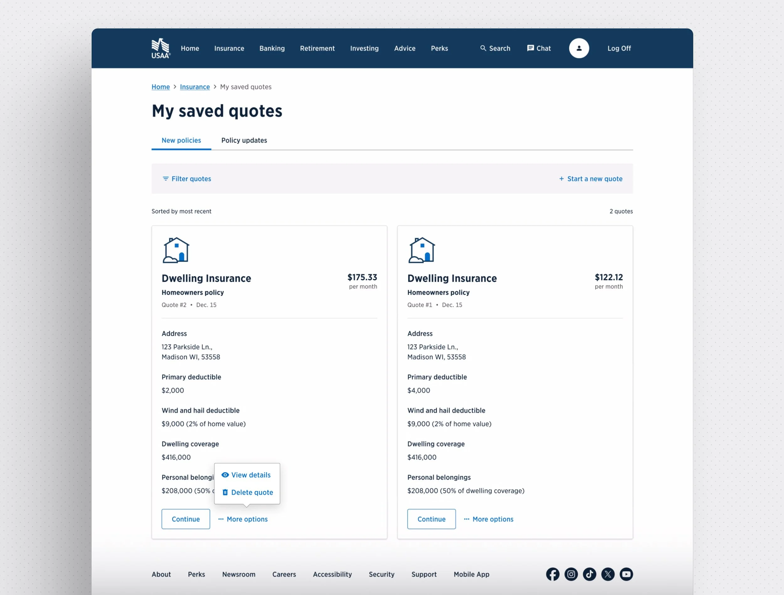
Retrieval and Management
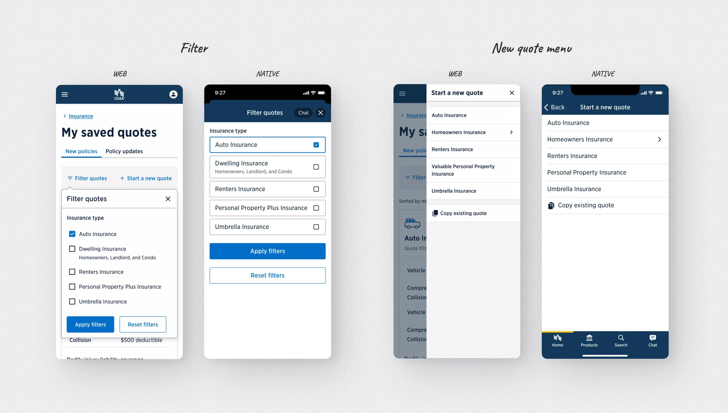
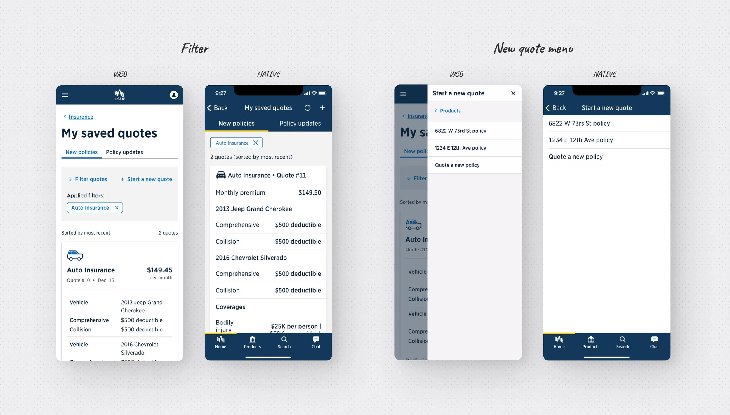
Quote organization and filtering
Acquisition and servicing quotes both live in the hub, but are separated by easy to distinguish tabs. This allowed a consistent retrieval experience no matter if it was your first or hundredth time searching for a saved quote. To get users to their quotes faster we also added the ability to filter, and automatically applied these filters if a user got to this page through a specific product storefront or from their existing policy summary. This filter also supported a unique case for Dwelling insurance where the policy type could be undefined, or change throughout a quote experience, requiring an all-encompassing label. A newly created “Member-friendly” quote number (sometimes up to 6 digits) replaced arbitrary product-specific numbers with one sequential number set across all products and bundles.
Reducing new quote friction
At first, starting a new quote from the hub to change an existing policy required a roundabout flow that redirected users to a policy selector page where they would be forced to dig through policy details to find a new quote button again. I proposed a streamlined approach that surfaced existing policies in the new quote menu on the hub, allowing users to jump directly into a quote flow. To further reduce friction, I also introduced the concept of duplicating existing quotes for editing, an idea later validated through user research and added to the product backlog.
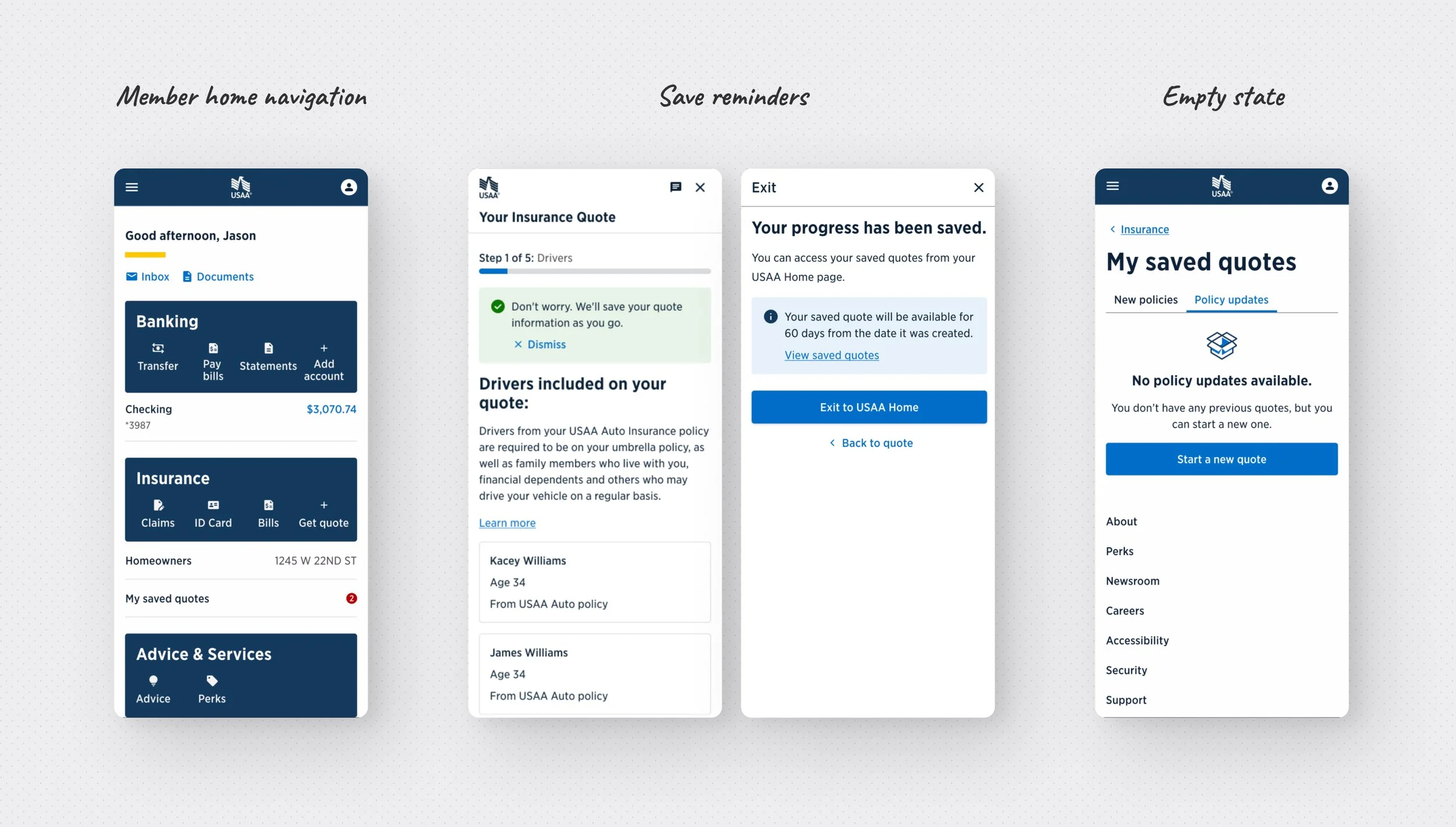
Handling price changes
Because insurance rating engines frequently change, quoted prices often shift over time. However, the existing experience did little to prepare customers for these updates. Since pricing changes could only be detected when a user resumed a saved quote, I proposed introducing a “speed bump” page to proactively explain potential changes before re-entering the quote flow. The pattern later expanded to support additional scenarios, such as new coverage options or invalid quotes caused by overlapping policy updates.
Research
Working with our research team, I planned and conducted nine rounds of unmoderated usability testing and one round of moderated testing for the web and native experiences. These studies garnered valuable feedback from hundreds of pariticpants to validate core design decisions and uncover several improvements including but not limited too:
Clearer labels for quote type tabs
Prioritizing quote details based on importance rankings
An expandable detail view for users wanting deeper information
Displaying price change breakdowns for servicing transactions
Improved recognition of policy links within servicing quotes
Clearer explanations of pay-in-full pricing
Optimal button layouts for native environments (multi-variant test)
Optimal layout and actions for bundled quotes (multi-variant test)
and dozens of other insights.
Cross-Team Collaboration & Impact
Although navigation to the Saved Quotes Hub was outside my team’s scope, I knew the page would only be effective if members could easily find it. Outside of member communications, existing navigation paths were limited, with the primary path leading through product storefront pages. To evaluate whether this path was intuitive, I spearheaded a tree test with 100 participants. The results showed that placing quote access directly in the main navigation improved the success rate of finding saved quotes by 22%, with 34% more participants navigating there directly without searching. We later coordinated with the global navigation team to ensure these findings could inform future updates.
For each product, we largely had to rely on the way data was already being presented in existing quote flows. As the only person with visibility into all these different products, I was able to recognize many inconsistencies as well as issues with design system implementation. This led to influencing several product experiences for better design system adherence, as well as leading multiple workshops with 30+ participants to get consensus on shared treatments. Among the treatments we established were consistent messages and reminders to reassure progress is being automatically saved when they started and exited the quote.
Throughout the design of the web and native solutions, I worked closely with USAA’s design system to ensure consistency while identifying opportunities where additional flexibility was needed. In 2025, I contributed 59% of my department’s accepted enhancement requests to expand and mature the system. Highlights include:
Side by side buttons in mobile viewports (web)
Status badges (web)
Column title wrapping in tables (web)
Insurance product icons (native)
Improved Webview exit experience across the app (native)
Expandable subsections (native)
Empty state pattern and icon (patterns)
Center aligned elements exception (patterns)
Built for the Future
The first iteration of the Saved Quotes Hub launched in October 2025, initially supporting individual product quotes. By shifting members from phone support to digital self-service, the platform is projected to reduce support interactions by approximately 100K calls per year, eliminating 5.6M minutes of support time and reducing operational costs by $10M+ annually.
The hub was intentionally designed as a scalable foundation to support future multi-product quotes (bundles), with the flexibility to expand to additional products over time. This aligns with USAA’s long-term strategy of simplifying policy management while encouraging bundled coverage adoption. New hub features such as discount highlights, expandable quote cards, and direct product access within bundles will further support quote management and comparison while preserving the hub’s core goal of simple quote retrieval.